Side art is such a critical part of the arcade look. Simple or complex, classic or modern, each game’s graphics are a part of the total experience. When we were spending hours (and hours) in arcades in the early eighties we were mesmerized by Tempest. The game itself was (and still is) fantastic. Unlike many games of that time there is a variability to each and every level that keeps the player on alert. The game was also housed in a unique cabinet design and had outstanding graphics.
If you have been following this blog at all, you already know this. Our obsession with Tempest led to this entire project and heavily influenced the design. Tonight the project took a huge step forward (not really that big, but per the previous paragraph an exceedingly important one).
We applied the side art!
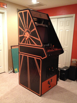
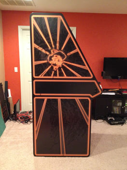
It looks even better in person than in the pictures! In the closer shot you can see the flipper and nudge buttons and the installed cup holder.
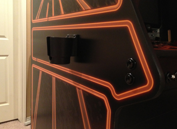
We are really pleased. Really. Really. Pleased.
Game On Graphics (was MameMarquees when I ordered this) printed the art for us. The file had plenty of extra black around it to overlap the sides. Once the cabinet was layed on its side we measured the actual width and height (as opposed to trusting the drawings) and also measured the distance top to bottom and side to side of the outside of the neon on the graphic. A little math later we knew that the black edge needed to be 15/16″ on the vertical sides and 1 3/16″ on the top and bottom. Then we carefully measured and cut a notch on two places on the back side and one place on the top:
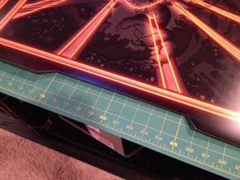
We then aligned those edges with the outside edge of the cabinet to align the graphic and taped them in place:
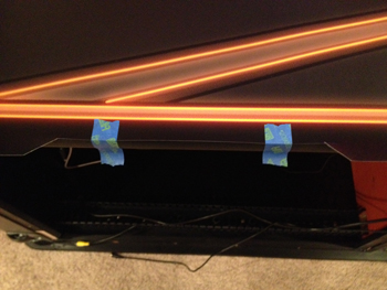
Once the graphic was positioned and secure we removed the backing along the bottom edge and carefully applied it to the cabinet. (we had wiped everything down with alcohol and a lint free cloth first of course)
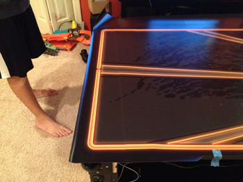
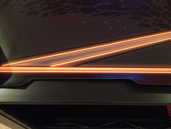
It is hard to see in the pic, but the light line slightly up from the bottom is where the backing was removed. Then it was simply a matter of one person holding up the graphic while another removed the backing and a third pressed the vinyl into place. We used lint free cloths to rub the vinyl into place and had very little trouble with bubbles.
Once the entire graphic was adhered and rubbed down the excess needed to be trimmed. We inserted a very sharp blade into the crack between the laminate covered cabinet side and the rubber T-molding and carefully sliced the vinyl all the way around the cabinet side:
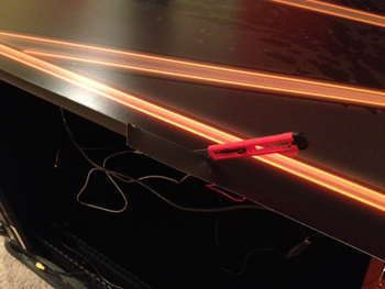
This cut the graphic vinyl inside the edge of the rubber T-molding producing a really neat edge. We then cut out the holes for the flipper/nudge buttons and the studs for the cup holders:
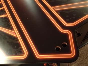
We tilted the cabinet back upright and reinstalled the buttons and cup holders.
Leave a Reply
You must be logged in to post a comment.